Surviving in today’s business world means making sure your website is mobile friendly. Why? Because mobile is where your customers are.
To paint a picture of why being mobile-first is important, here’s what you should keep in mind:
- In 2018, 52% of all website visits were from smartphones and tablets
Not surprisingly, more and more people are using their small screens to search instead of their desktop computers. A glimpse into the next few years suggests that 72% of people will use just their mobile devices for Internet by 2025.
What does this mean for your business? Well, you should’ve started optimizing your website for mobile yesterday. But, it’s not too late! Keep reading to learn 5 ways to make your site mobile-friendly, so that people can find you and get the best experience while browsing your site.
- Google prioritizes websites that have a mobile-friendly, responsive design
With the majority of people searching from their mobile devices, it makes sense that Google is pushing websites to be more mobile-friendly. In 2015, Google started ranking mobile-friendly sites higher on mobile search results. And more recently, they said that they’ll be considering the speed in which webpages load as a ranking factor.
Is your site brand new? Starting July 1, 2019, Google will be using the mobile version of new websites for indexing and ranking.
[DOWNLOAD]

So, What Exactly Makes a Mobile-friendly Website?
Simply put, your website needs to be easy to navigate and work well on small screens. It should have a responsive design whether it’s displayed in portrait or landscape orientation.
Your Basic SEO Checklist for a Mobile-friendly Website
To help you drive more traffic to your website, we’ve put together this checklist for doing effective SEO practices.
1. Mobile content
Google wants your mobile site to have the same content as your desktop site. This includes text, images and videos.
2. Boost page speed
You can’t afford to lose conversions and profit because of a slow site. Visitors will leave pages that take more than 3 seconds to load and you’ll instantly get on Google’s bad side. To boost your site speed, try reducing your image sizes, switch to a faster hosting option and use a simple website design.
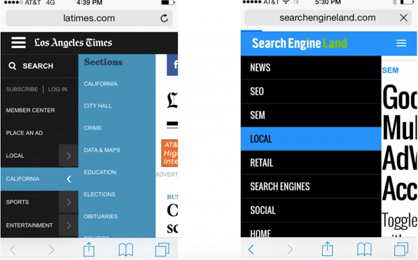
3. Responsive design
While a responsive website takes the same content (URLs, images, HTML, etc.) from desktop to mobile, it doesn’t end there. You still have to optimize your site for user experience. To do this, you have to scale your images for mobile users. Here’s what we mean:
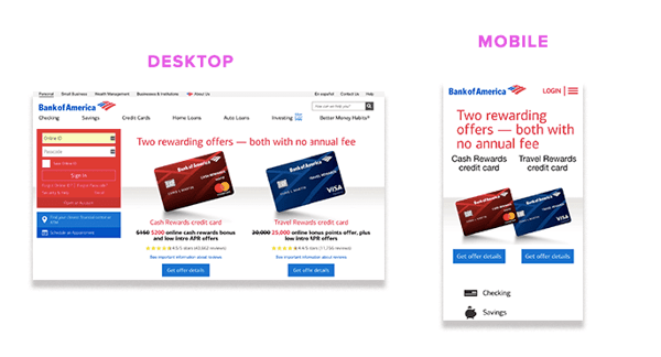 Photo credit: Search Engine Journal
4. Separate URLs
A mobile page has its own URL. For example, a desktop URL is www.yourwebsitename.com and your mobile URL is m.yourwebsitename.com.
The mDot site is specifically designed for mobile devices and you can customize the user experience however you want.
You need to add a special link rel=“canonical” tag pointing to the corresponding desktop URL, like this:
<link rel=”alternate” media=”only screen and (max-width: 640px)”
href=”http://m.example.com/page-1″>
5. Titles and meta descriptions
Make sure your title and meta descriptions are the same on both versions of your site, desktop and mobile.
Remember, your meta description is a short paragraph that describes its content and should be compelling enough to get people to click your link.

Over to You
The future of mobile search is here, and your website needs to be optimized to stay competitive.
Get more website tips and techniques that will bring you fast results in the following guide: