Are you calls-to-action seeing less action than you would like? It may not really be the language or content of the CTA that is hindering its success. The location of the call to action can be just as important as what it says. You can write the world’s greatest CTA, but if it is buried on a cluttered landing page, it might not be found. So, let’s explore the best locations for a call to action.
-
Above the Fold
Think of this as the “old standby.” A tried and true go-to like your favorite pair of jeans. Putting the CTA front and center on the landing page is certainly direct and hard to miss. However, on the flip side, some readers might find it too aggressive—you risk turning them off before they are engaged in the content of the page. So, if you are going above the fold absorb visitors with a catchy headline, clean look, and clear content. Tell them exactly what they will get and highlight any other important details such as date and time. Note that many marketers are moving away from above the fold, some going so far as calling it a myth that does not really impact conversion.
-
Below the Fold
For those of your who are old-school marketers, below the fold might cause you to twitch a little. In days gone by putting any type of actionable item below the fold was a death blow, but not anymore. Just below the fold can give you a little more breathing room for your content as discussed above. And, more space means you can draw readers in with than just an appealing headline and strong language—you can craft a story and make more of an emotional connection with detailed information.
Whether you are going just below the fold or a bit further down, say you have a long form landing page, be sure to include directional highlights and clearly pinpoint the actionable CTA. Is imperative to keep the page clutter free and make the steps evident with directional clues such as arrows, colors, and clever imagery.
-
The Bottom of the Page
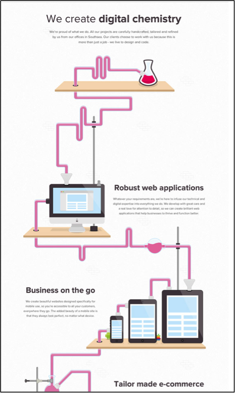
When you think about it, the bottom of the page is just an extension of below the fold. And, while people are generally used to—and more amenable to—scrolling, you have to make it worth their while. So, if you are going to put the call to action near the bottom of the page you need to have compelling reason…and give readers a compelling reason to take the journey with you. Don’t be afraid to mention the offer several times, and, of course, use directional clues and action-based to retain attention. Or, use of clever graphics like this excerpted example from Si Digital, which implements animation, “digital chemistry,” and entertaining language to propel readers to the bottom of the page.

The bottom line is this: regardless of where the call to action is you want readers to take that action, and certain key criteria that will make that happen. You must motivate them to take action via well-written content that reminds them how they will benefit from in exchange for completing the form. Use smart directional clues to reiterate how and where the CTA is located. Finally, keep the page visually appealing with crisp design and striking colors. People might not mind scrolling a bit, but they don’t want to go digging for something that should be easy to find.
Think below the fold is blasphemous? Have at CTA test success story?
